Empowering Users to Find Community
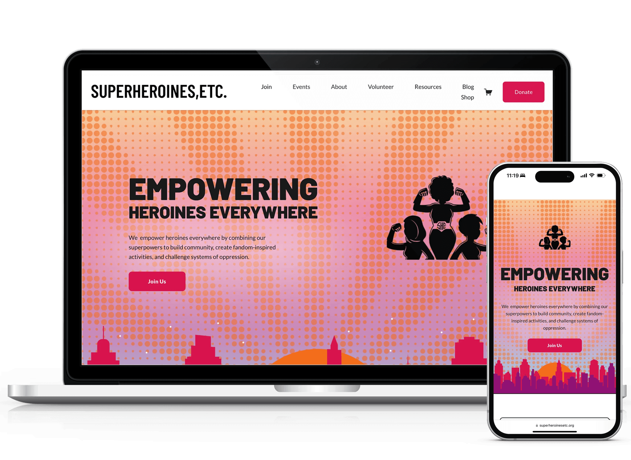
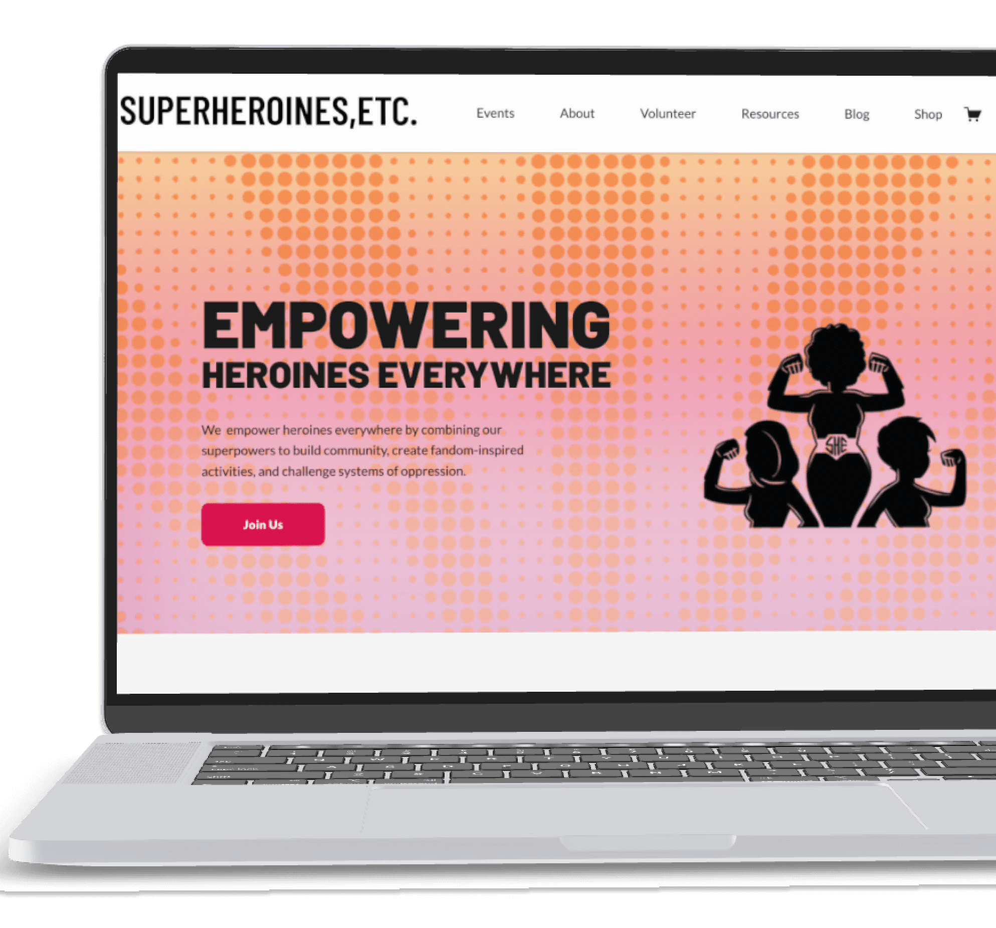
A collaborative redesign that aligns site with updated organizational strategy though copy, improved informational architecture and UI principles.
LIVE SITE
PROJECT OVERVIEW
WHAT IS SUPER HEROINES, ETC?
Super Heroines, Etc. is a nonprofit dedicated to empowering women through inclusive events, classes and workshops. Typically, they focus on all things nerdy - a space that has excluded women in the past.
After leadership changes, Covid-19 impacts and a dwindling membership base, the Super Heroines, Etc. team recognized they were no longer connecting to their target audience.
MY ROLE
While I was the sole designer on this project, I worked closely with the director and marketing team. I sought to understand users and their issues, discover and implement solutions, and to ultimately increase user engagement in conjunction with their efforts.
SKILLS
UX RESEARCH
UI
ACCESSIBLE DESIGN
INTERACTION DESIGN
VISUAL HIERARCHY
INFORMATION ARCHITECTURE
MY ROLE
UX Design, UX Research
TIMELINE
8 Months
TOOLS
Figma
Notion

G Suite
UX Tweak

GA4
Google Meet
Discord
Canva
Squarespace
DISCOVER & DEFINE
UNDERSTANDING THE USER
After developing a research plan, I began recruiting survey and interview participants to better understand their goals, expectations, needs and challenges. However, finding existing members proved difficult. Although a few participants completed the survey, the responses were insufficient to move forward in confidence.
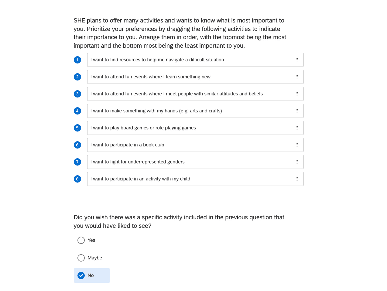
Survey I sent out to members
OVERCOMING A CHALLENGE
To supplement the limited data, I conducted secondary research on nonprofit engagement, particularly focusing on millennial behaviors and motivations, community involvement, and donation patterns. Additionally, I interviewed the founder to gain insights into past users' needs and behaviors.
USER PERSONA
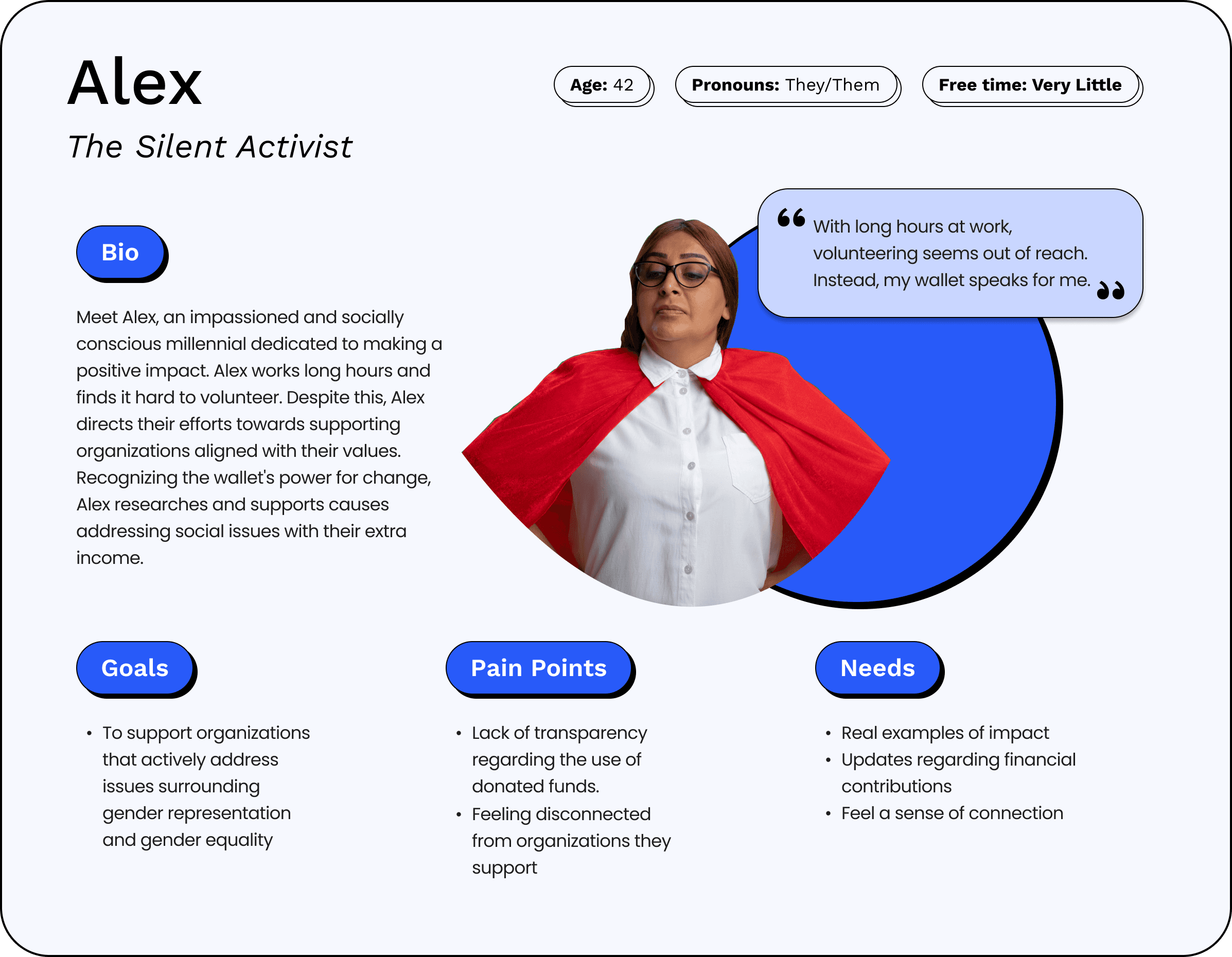
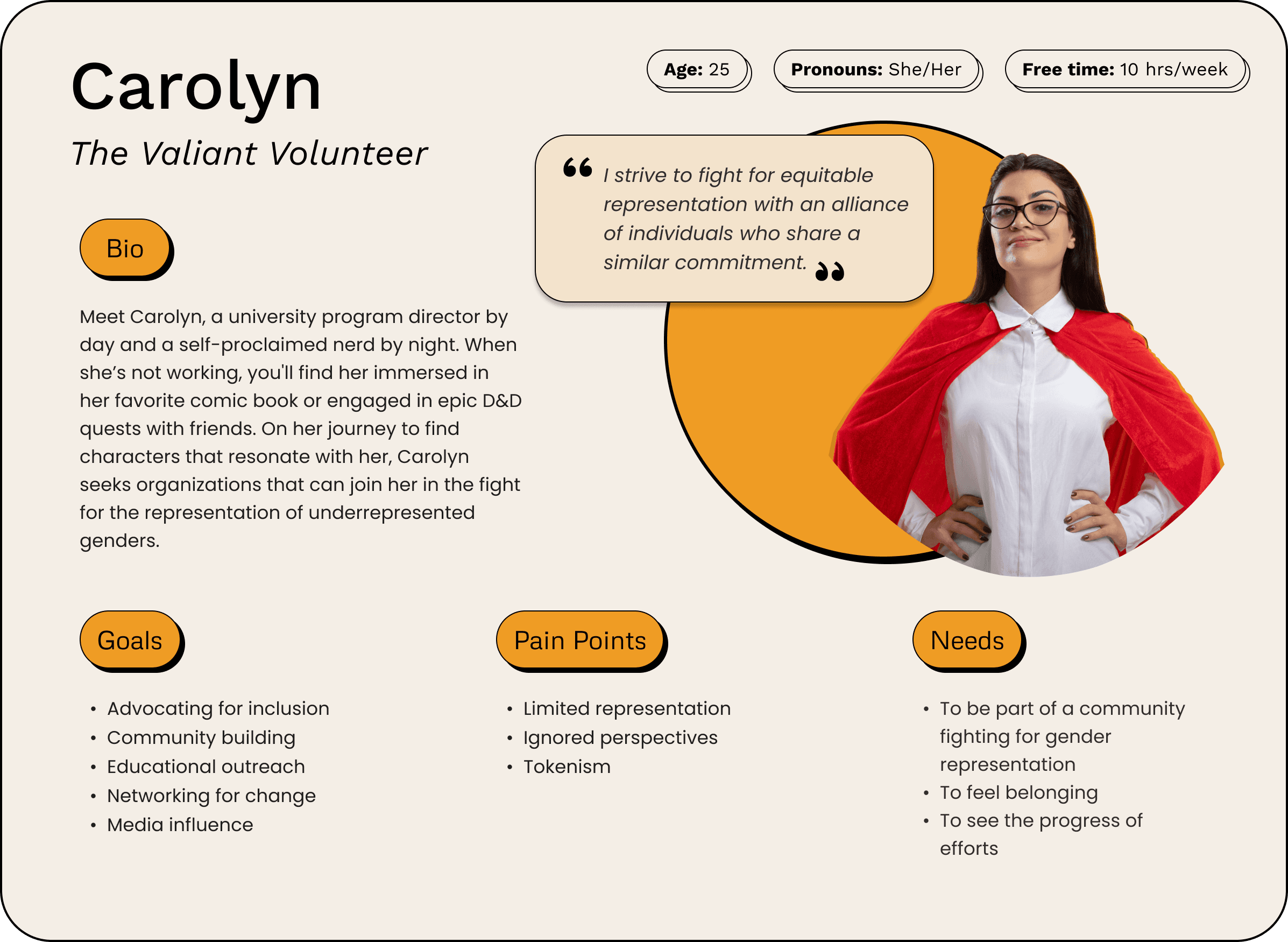
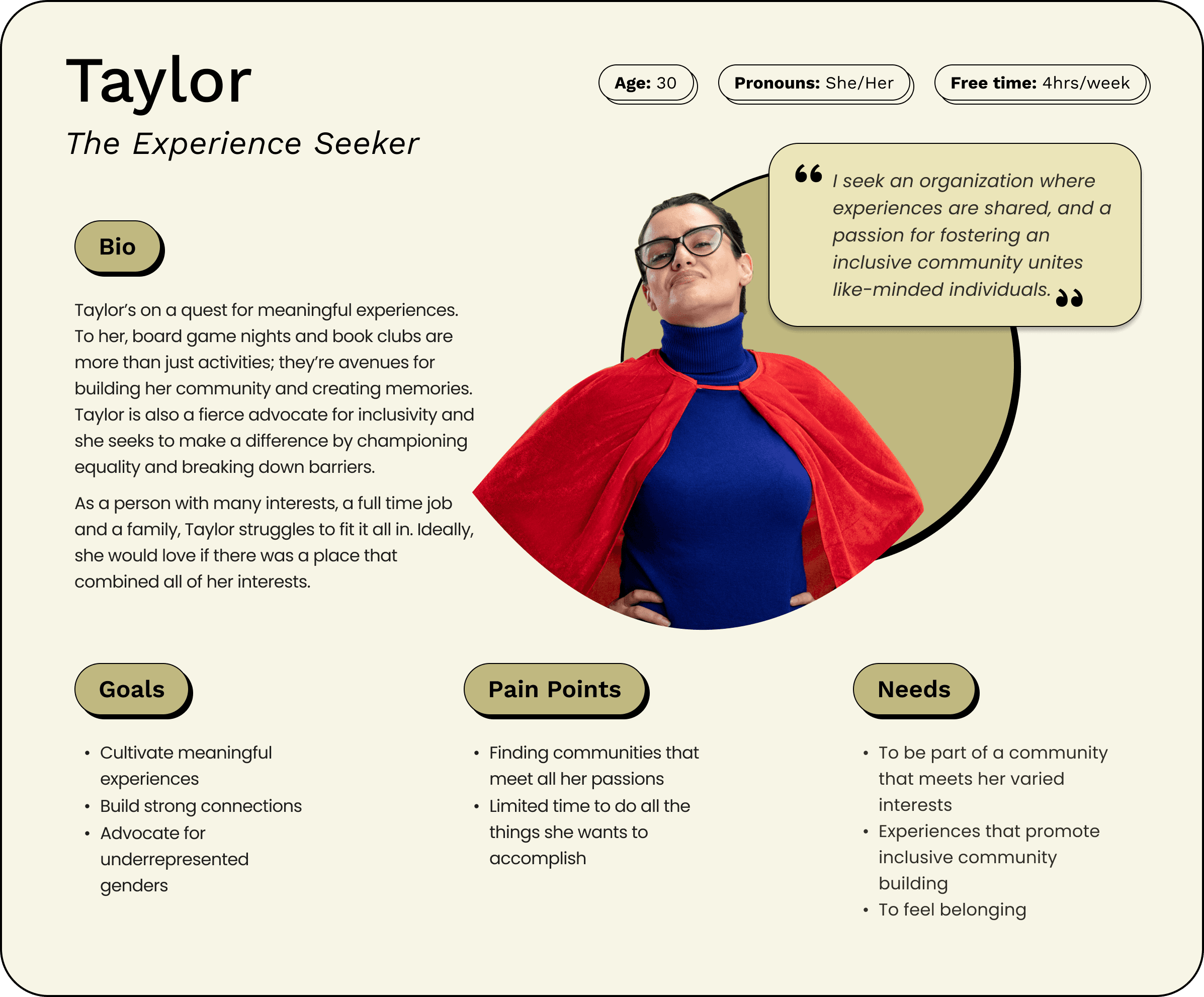
Secondary research, data and interviewing the founder helped to create 3 user personas. As the membership base grows, these personas can be refined to represent the Super Heroines Etc., membership base.
USABILITY TESTS
After identifying the users' needs, goals, expectations, and pain points, I conducted three usability tests with participants matching the target audience. They were asked to complete seven tasks, including signing up for an event, making a donation, becoming a member/volunteer, and navigating to the shop. Additionally, participants provided feedback on specific pages to assess comprehension.
What does the organization do?
Took participant 5 min to understand what org is about.
Participant 1
Participant 2
What does the organization do?
“This is much different that what I originally thought.
Participant 3
INSIGHTS
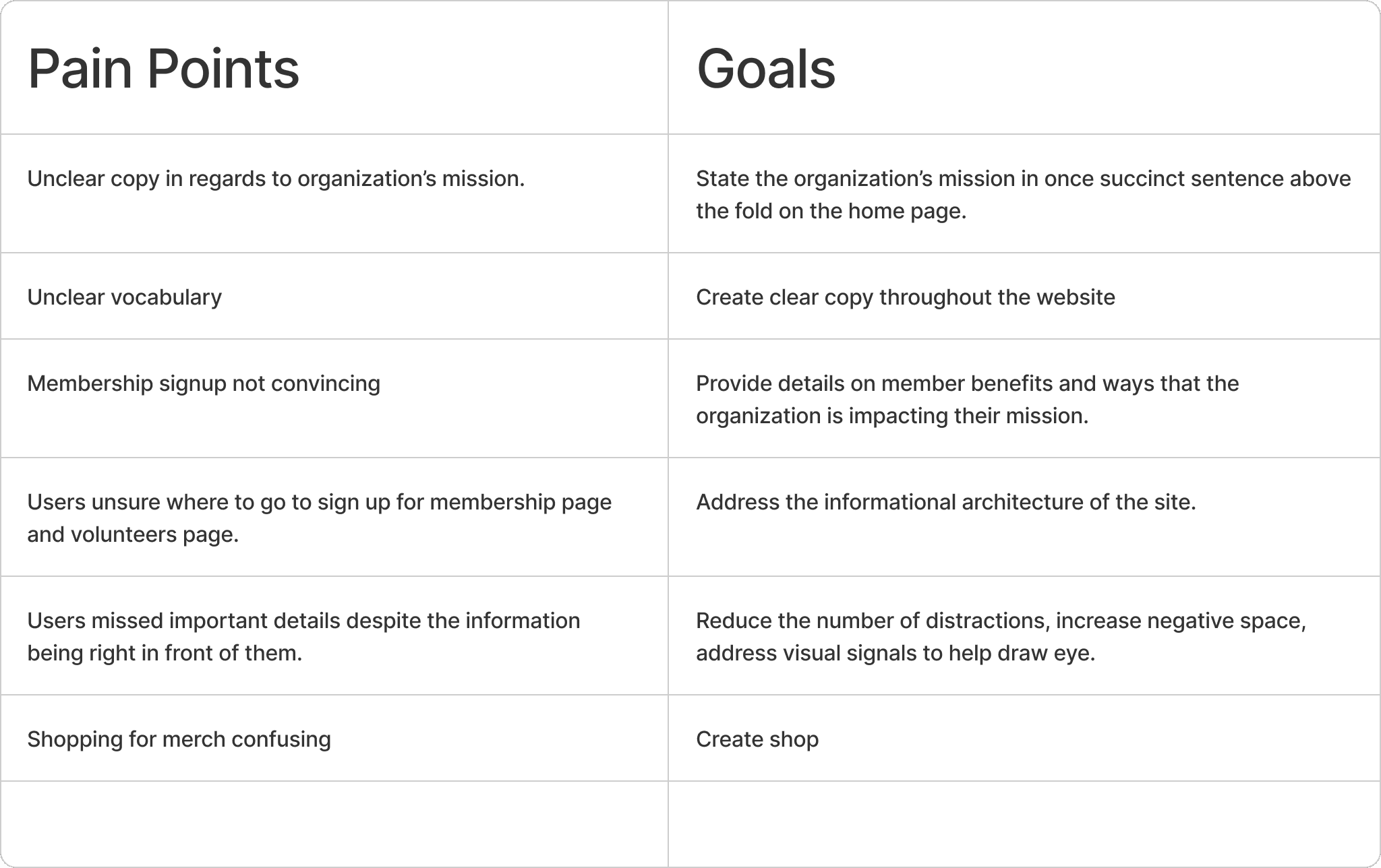
Through affinity mapping, I identified the following key insights and developed goals for pain points.
Unclear Copy and Vocabulary:
Confusion around the organization’s mission due to unclear language and terminology, indicating a need for refined messaging.
Membership Sign-Up Challenges:
Users found the sign-up process unpersuasive and confusing, suggesting the need for a more compelling and straightforward process.
Missing Important Details: Some users overlooked crucial information, highlighting the need to enhance the visibility of key details.
PROBLEM STATEMENT
PRIORITIZING
I facilitated a collaborative workshop with the client to define and prioritize project goals. We identified key priorities, including improving the copy, information architecture and usability. We agreed that while visual design was important, it was less urgent and would depend on completing essential tasks first. Additionally, although the client valued membership features and incorporating Discord, we decided to hold off on these, as the client was not yet ready to implement them.
IMPROVING NAVIGATION: INFORMATION ARCHITECTURE AND SITE MAP
Examples of navigation issues:
100% Users were unable to find volunteer positions.
66% of users questioned what 'take action' meant.
Shop inaccessible because the only way to access it was to click on the cart and navigate to the shop from cart.
The Fix:
To address navigation issues, a card sort was conducted to understand how users categorized information, leading to the development of a new site map. Insights from Google Analytics were also utilized to strategically place information and calls-to-action (CTAs), such as prompting users to sign up for email updates and showcasing related blog posts. I also explored how other sites navigated sites through the site.
Before
After
IMPROVING COPY
The Challenge and Solutions:
The primary copy challenges included having too much content on some pages, too little on others, and using language that didn’t resonate with users. For example, 66% percent of users questioned what "embraced inner nerd meant." In addition one user saw the word 'nerd' and immediately assumed the organization focused on women in tech. I worked to closely with the team to craft compelling copy that was familiar to the user and answered the user's questions while also being succinct.
Another major challenge was crafting a tone of voice that aligned with the organization's new values. Super Heroines, Etc. emphasized 'Nerdy Joy' and 'Social Justice and Anti-Oppression.' So the goal became to develop copy that conveyed a tone that was positive, assertive, and empowering.
Results and Learnings:
Overall, the reception of the copy has been positive in testing. However, there has been a reaction to using words such as "oppression". In hindsight, I think it would have been wise to test the tone of voice with users before finalizing copy.
IMPROVING USABILITY: HEURISTIC EVALUATION AND UTILIZING VISUAL DESIGN PRINCIPLES
IMPROVING VISUAL DESIGN
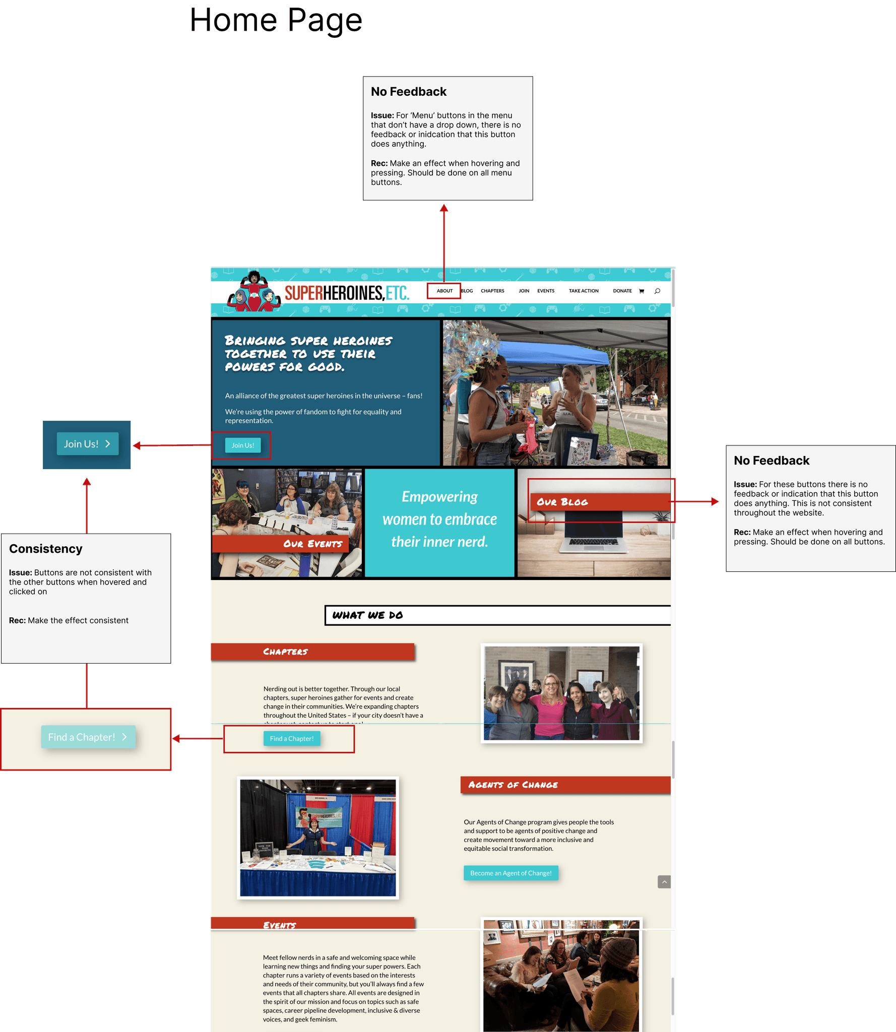
Users were missing key details, even though the information was available. I hypothesized that this was due to the website's lack of adherence to visual design principles. To address this, I introduced more negative space, applied Gestalt principles, and established a clearer visual hierarchy. We also updated the color palette to increase contrast and ensure alignment with the brand, making the overall design more intuitive and user-friendly
EVENT PAGE: BEFORE AND AFTER
VOLUNTEER PAGE: BEFORE AND AFTER
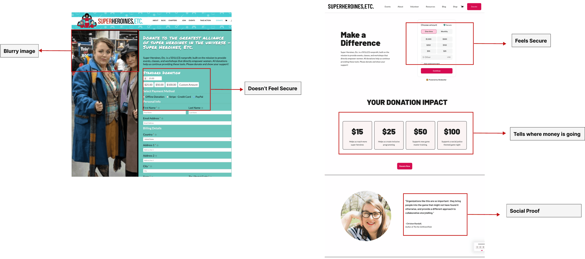
DONATE PAGE: BEFORE AND AFTER
CONCLUSION
Working on a project aimed at creating inclusive spaces for everyone has been incredibly rewarding. This organization's dedication to addressing such a significant issue is truly inspiring. Being able to apply my UX skills to contribute to this meaningful cause has been both fulfilling and exciting.
The redesigned website reflects a collaborative effort to address challenges and foster growth and impact. By prioritizing user needs and organizational goals, the revamped platform will exemplify the organization's commitment to equity, representation, and inclusivity within the fandom community. Ongoing iterations and optimizations will ensure that Super Heroines, Etc. continues to thrive in its mission-driven endeavors.
It's important to acknowledge that this project is still a work in progress, with ongoing efforts to make a lasting impact. Stay tuned for updates on our journey towards creating more inclusive spaces for all.

