How UX design principles built an accessible health information library.
LIVE SITE
PROJECT OVERVIEW
THE MISSION
Retina Global is a nonprofit organization dedicated to providing crucial retina care to individuals worldwide, particularly in underserved communities.
MY ROLE
CONSTRAINTS
Constraints, while challenging, can spark innovation. When we joined this project, it was already underway, with most user research completed. Time and budget were tight and the site's Wix platform limited customization, prompting us to think outside of the box to achieve some of the projects goals.
ROLE
UX Design
TEAM
UX Design Team
Copy Writing Team
TOOLS
Figma
Notion

G Suite
Discord
Wix
Google Meet
SKILLS
UX RESEARCH
ACCESSIBLE DESIGN
INTERACTION DESIGN
VISUAL HIERARCHY
UI
INFORMATION ARCHITECTURE
My roles and responsibilities
Redesigned Retina Global’s Knowledge Hub to streamline navigation, enhance UI and accessibility, and reduce cognitive load.
Optimized donation flow with accessibility enhancements, streamlining the user journey and improving inclusivity, which resulted in a 200% increase in user donations.
Partnered with the content writer, ensuring accuracy and clarity in presenting medical information.
THE PROBLEM
Initial discussions with Retina Global's founder emphasized the challenges faced in remote regions around the world where access to eye care is limited. In many cases, individuals wait months or even years for treatment. While Retina Global works to bring doctors to these communities, the organization is small, and the need far exceeds their capacity.
The founder also emphasized that there is a lot of inaccurate retina information out there. Providing accurate, accessible information, especially for those with limited vision, can empower individuals to make informed decisions about their eye health and to seek care when necessary.
"There is a lot of bad information out there….we want to be a place where people can receive accurate and vetted information."
- Retina Global Founder
THE SOLUTION
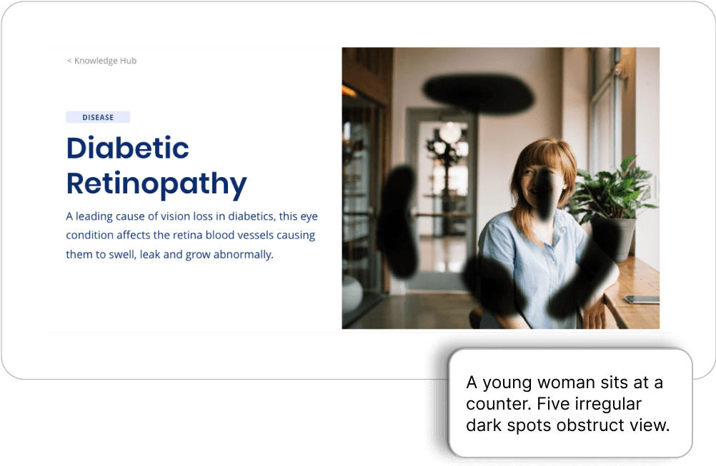
Knowledge Hub, an accessible and trustworthy digital library on retina diseases and treatments.
Preview of the final project.
Improved Information Architechture
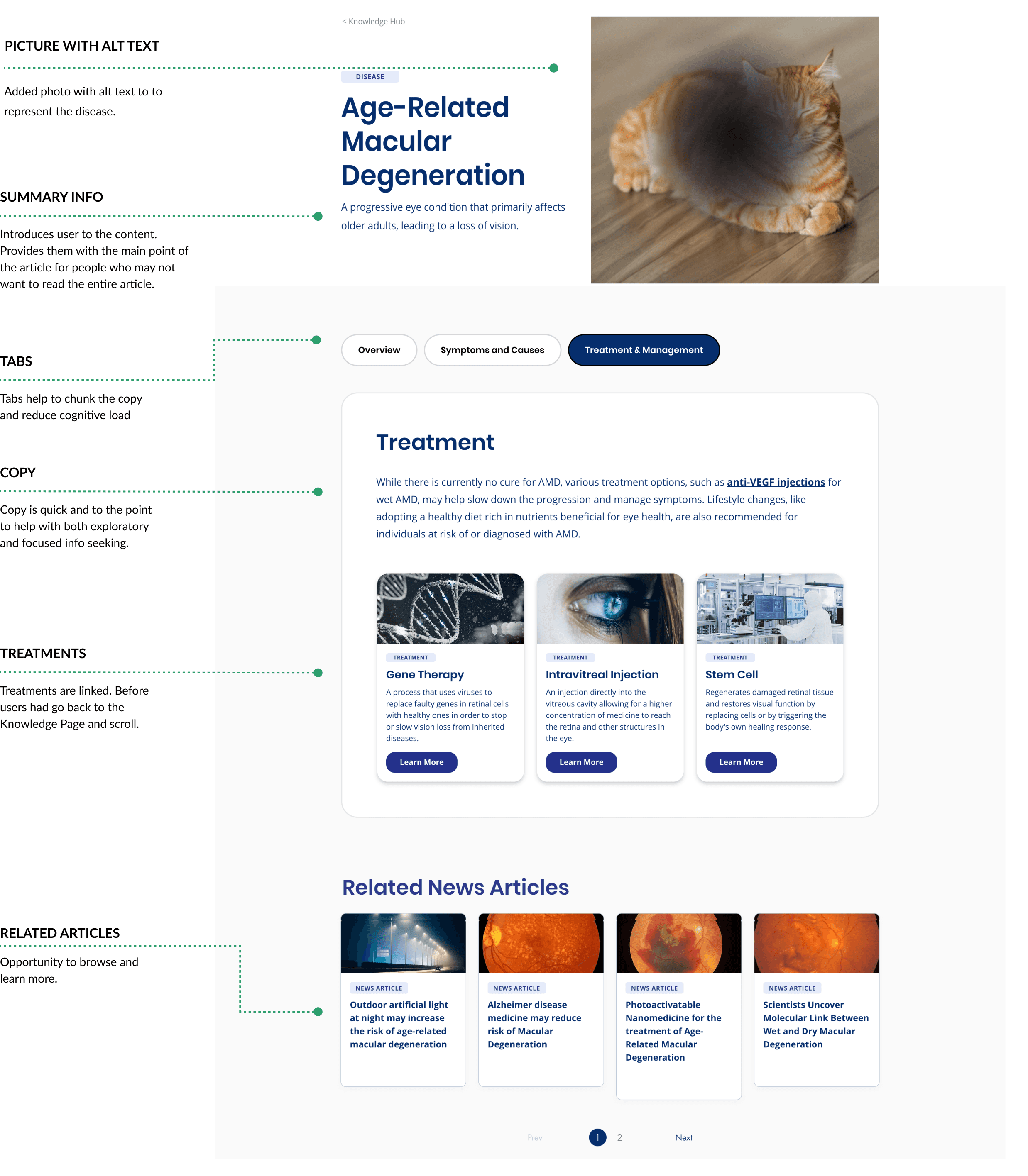
Chunked information reduces cognitive load, allowing users to absorb essential content more efficiently and navigate with ease.
Enhanced UI
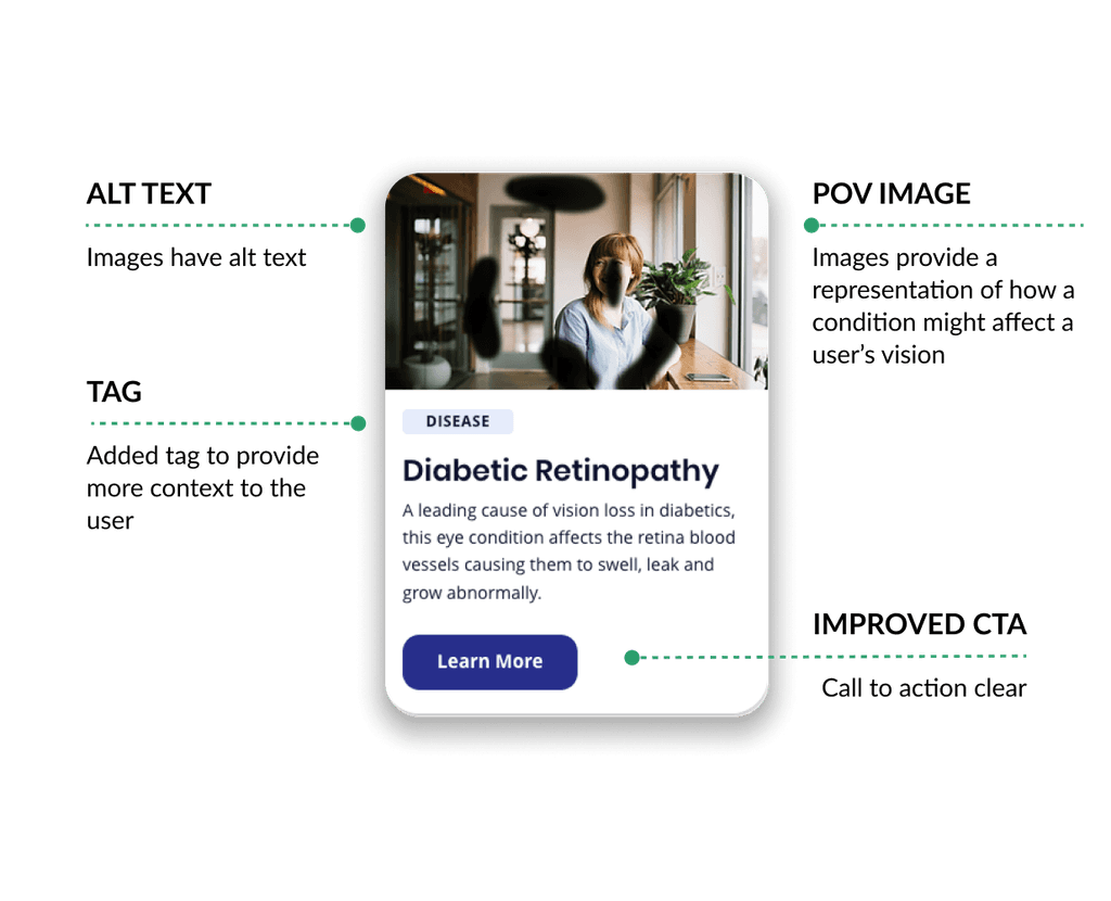
Improved cards present key details with clarity, helping users quickly identify relevant information.
Accessible for All Users
Alt text for images helps visually impaired users engage with the content to provide a more inclusive experience.
DISCOVER & DEFINE
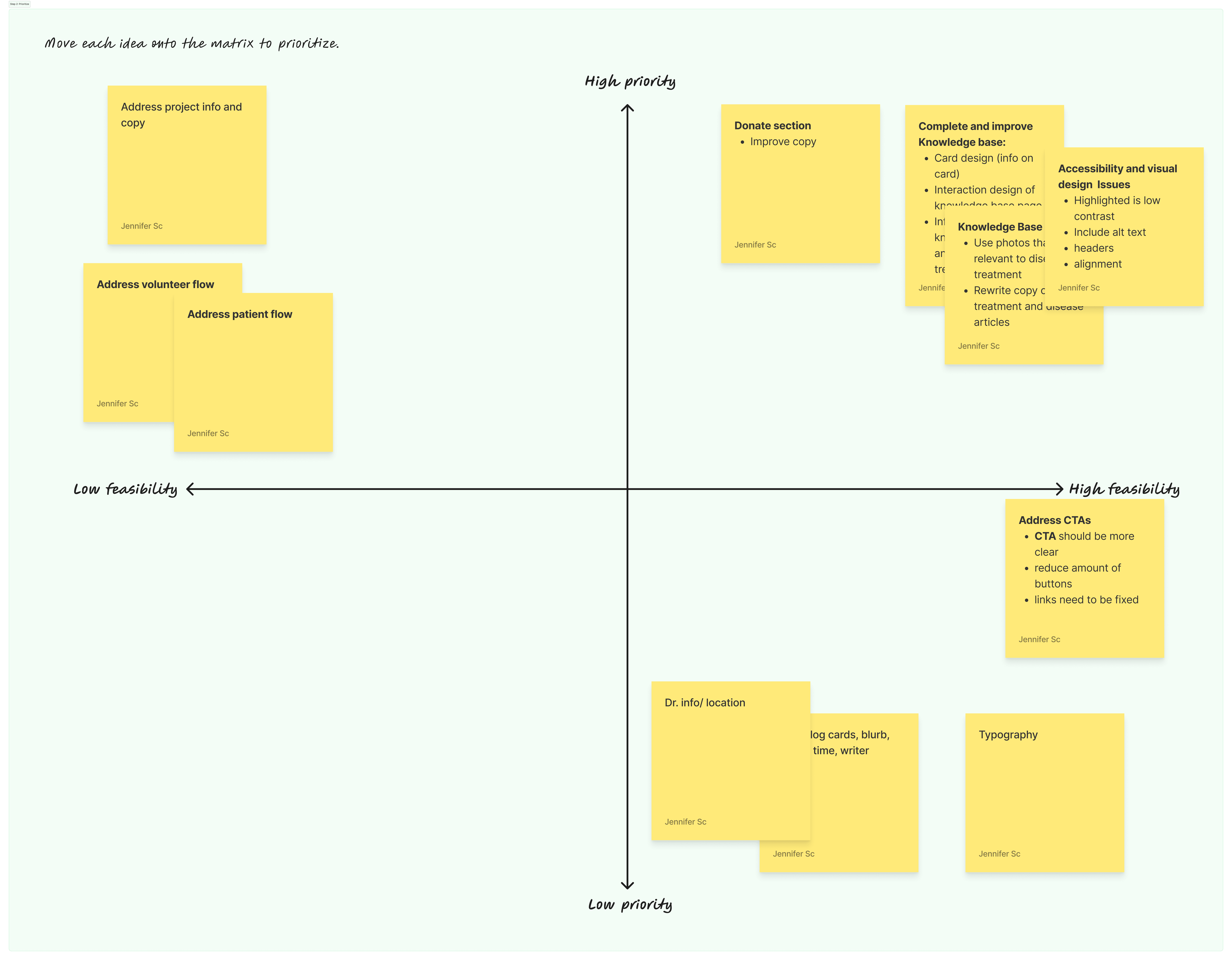
HEURISTIC ANALYSIS AND PRIORITIZATION
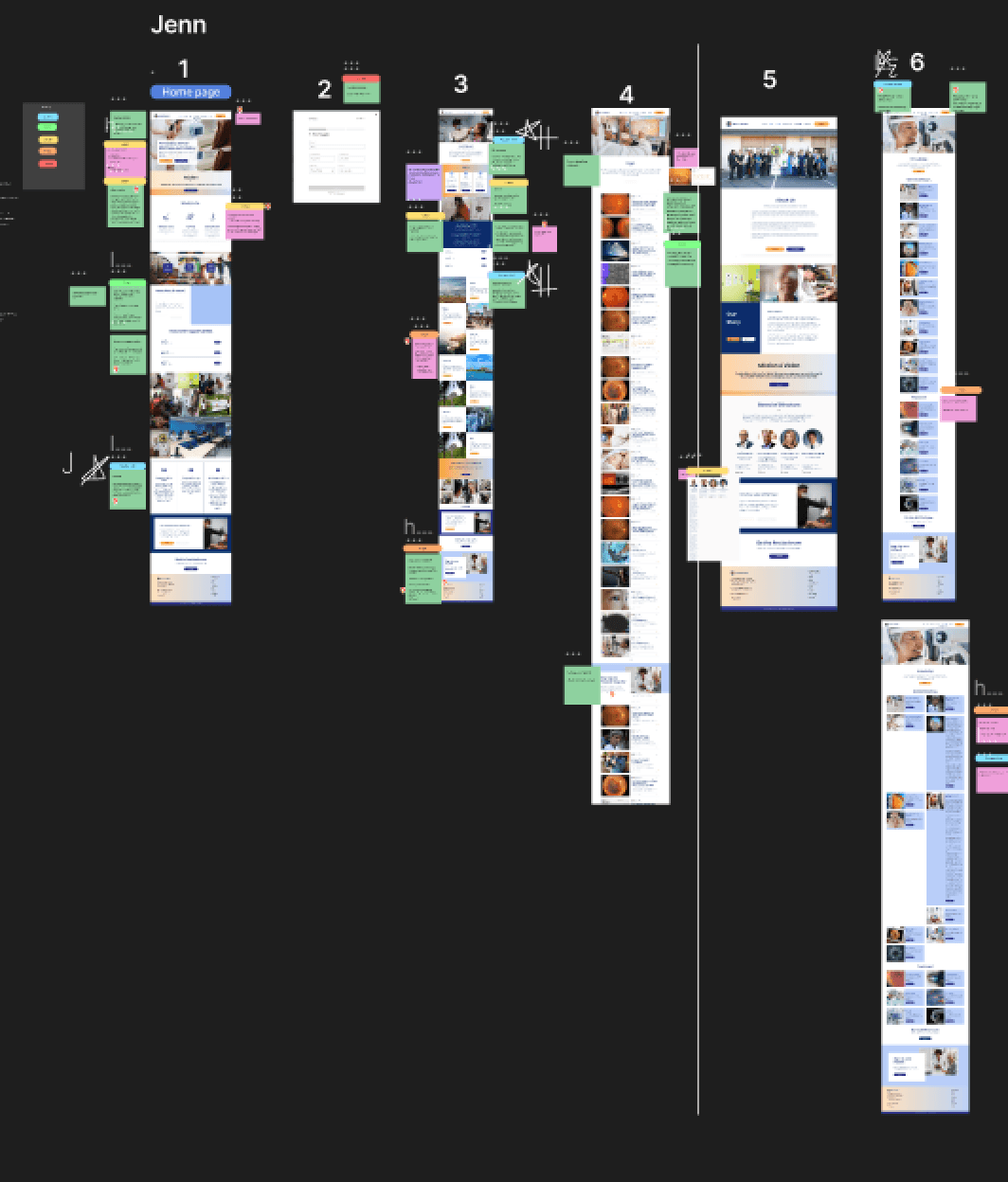
When we began the project, we didn't have a clear idea of what we would be working on because there were several items that still needed to be finished. To gain clarity, we decided to audit the site and existing research to understand the big picture.
To do this, we analyzed each page to assess usability and accessibility issues. Then, we prioritized issues based on their urgency and their feasibility. After looking at the user research, we decided to focus on completing the Knowledge Hub, which had a high impact, feasible, and met organizational and user goals.
Note: The Knowledge Hub was started but was basic skeleton with no structure.
Collaborative Site Audit in Figma
EMPATHIZING WITH THE USER
We reviewed the existing research, including 3 user personas —the patient, the volunteer, and the donor — deciding to focus on the patient as the primary user of the Knowledge Hub. Prioritizing this group meant we needed to design for people with impaired, or no vision.
The previous designer had already implemented accessibility guidelines for font, color contrast, and spacing and Wix had been chosen due to it's screen reading compatibility. As we progressed, we kept these standards in mind along with a few other WCAG guidelines, including responsive design and alt text for images.
CONTRAST
Maintain a contrast level of 4.5:1.
RESPONSIVE
Responsive site page so that content adjusts with zoom.
SCREEN READER
Making sure content is accessible with screen reader.
PROBLEM STATEMENT
FEATURE RESEARCH
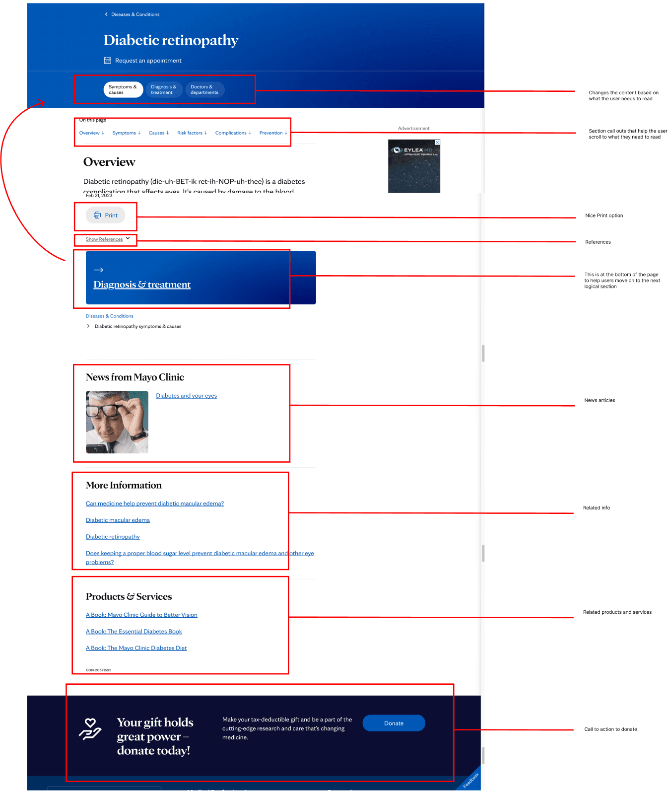
With Jakob's law in mind, I looked to other information libraries to identify familiar patterns and solutions. While we took note of some great patterns such as information chunking, visual hierarchy, we noticed a few gaps such as lack of POV imagery.
Collaborative Site Audit in Figma
SECONDARY RESEARCH
Since navigation was difficult with our interviewees, we conducted secondary research to ensure our designs addressed the diverse ways users search for health information. The findings below informed our decision later on to introduce a search bar and filters to help meet various search methods.
BENEFITS OF GOOD SEARCH UI
The benefits of having good UI include:
Improved knowledge acquisition.
Increased number of page reads.
Increased site engagement.
FACTORS IMPACTING SEARCH METHODS
Users' search needs vary when searching for health information and depend on:
Level of knowledge about the problem.
Levels of curiosity.
Perceived situational relevance to the health problem.
TYPE OF SEARCHERS
Focused seekers: Users who know what they are looking for and concentrate on a narrow range of information.
General Seekers: Users who browse for information and might not know exactly what they need but benefit from easily accessible, broad content.
DESIGN & DEVELOP
SITE NAVIGATION AND USER FLOW
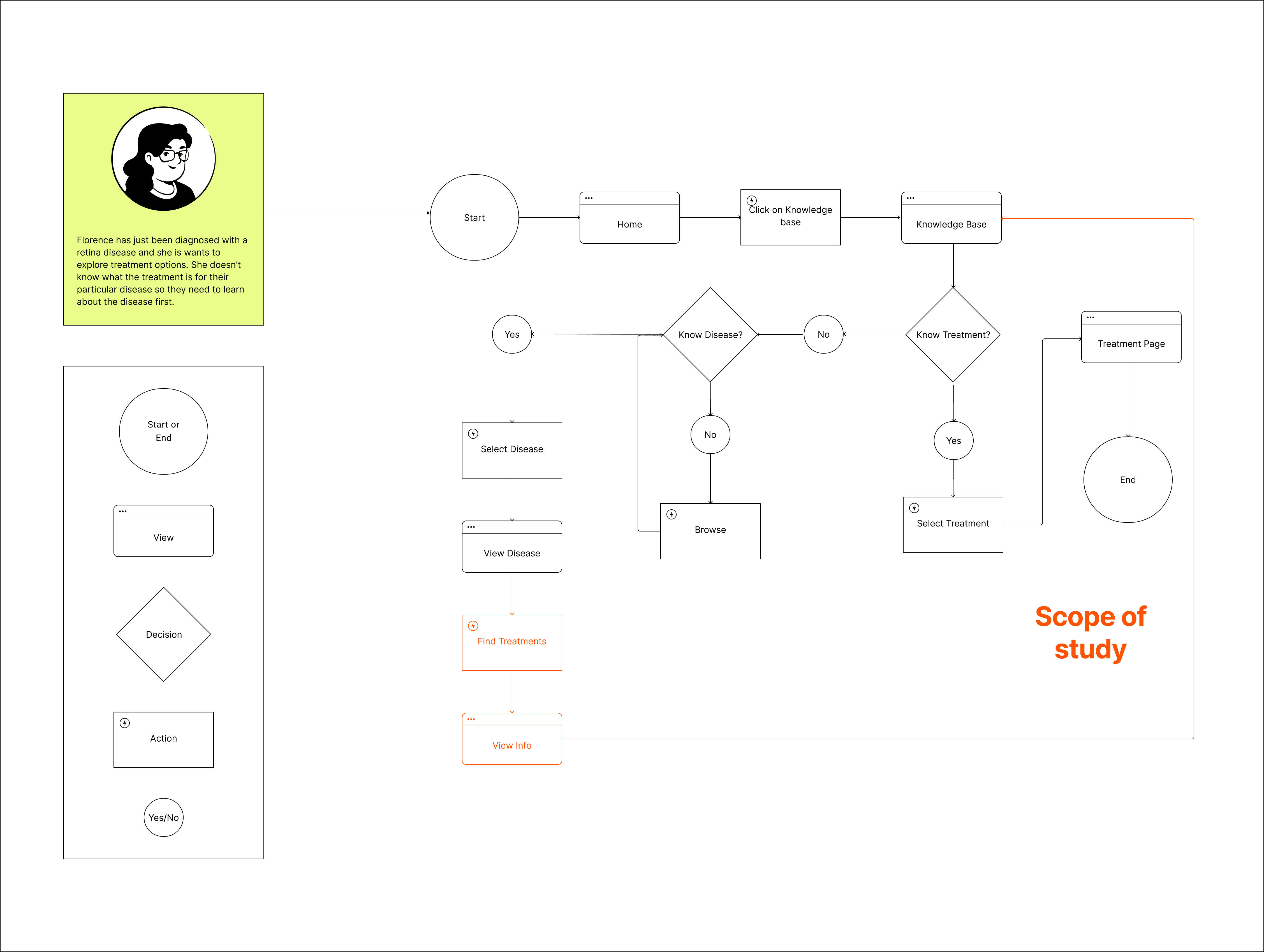
After synthesizing user research, I mapped out the current user flow, identifying critical pain points where users struggled to find and access information. The elements in orange were the areas of concern. On average it took users 4 clicks to go from the home page to finding a specific treatment if they did not know the treatment they were looking for.
SEARCH AND FILTER
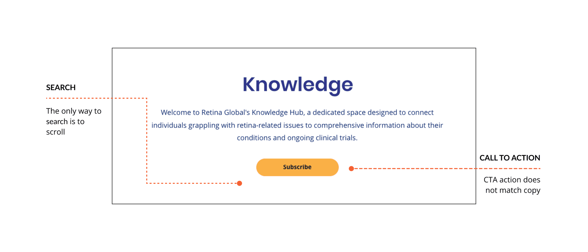
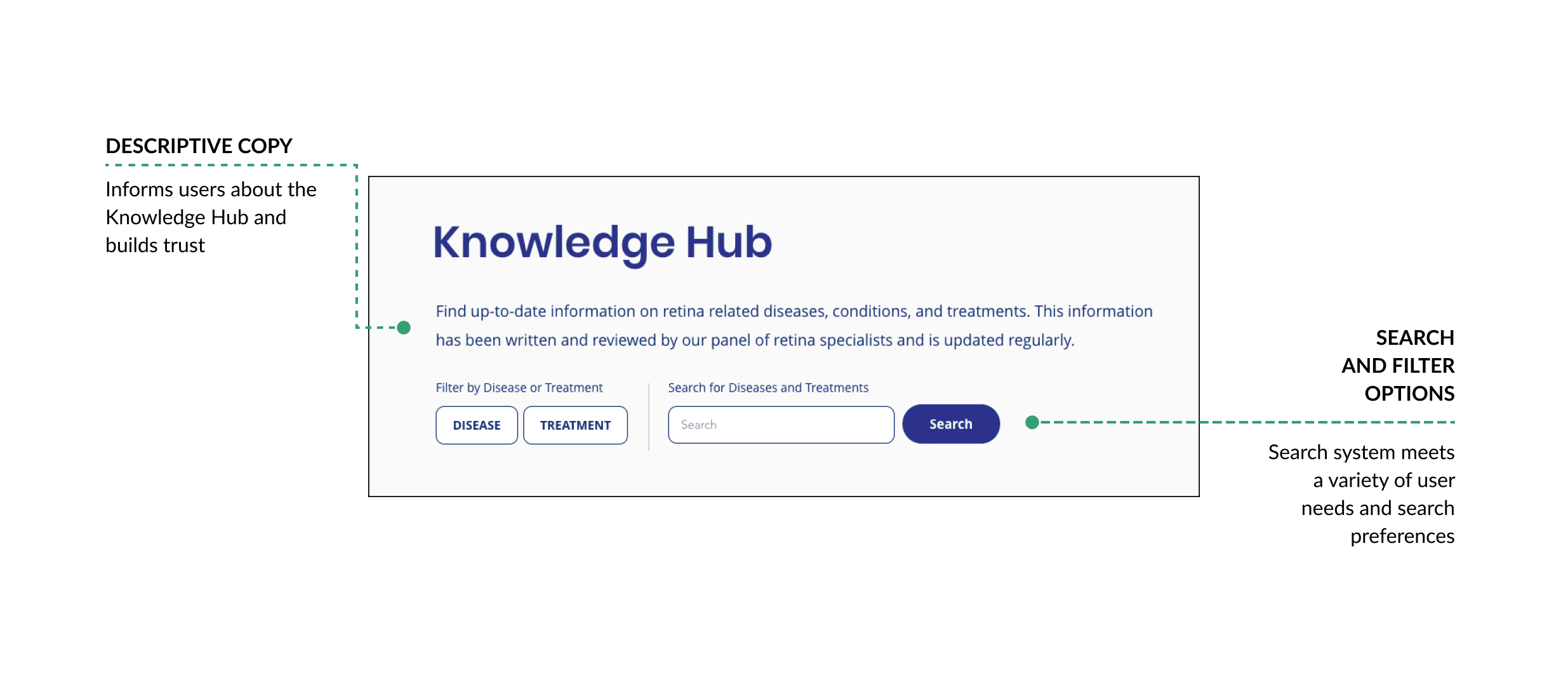
Our research revealed that search behaviors vary widely, so we introduced several search options, including a search bar and filters by disease or treatment. This allowed us to cater to both focused and general information seekers.
BEFORE
AFTER
IMPROVED DISEASE AND TREATMENT CARDS
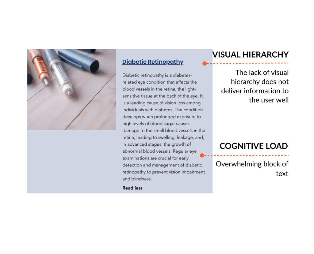
Redesigned cards for disease and treatment articles provided visually organized information, supporting quick information scanning.
BEFORE
AFTER
CONTENT CHUNKING
Content was organized into digestible sections, enabling users to scan pages more easily and focus on important information.
Example of Article Page
BONUS: IMPROVING THE DONATION PROCESS
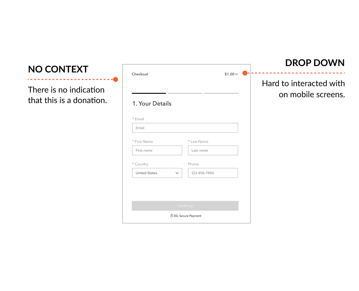
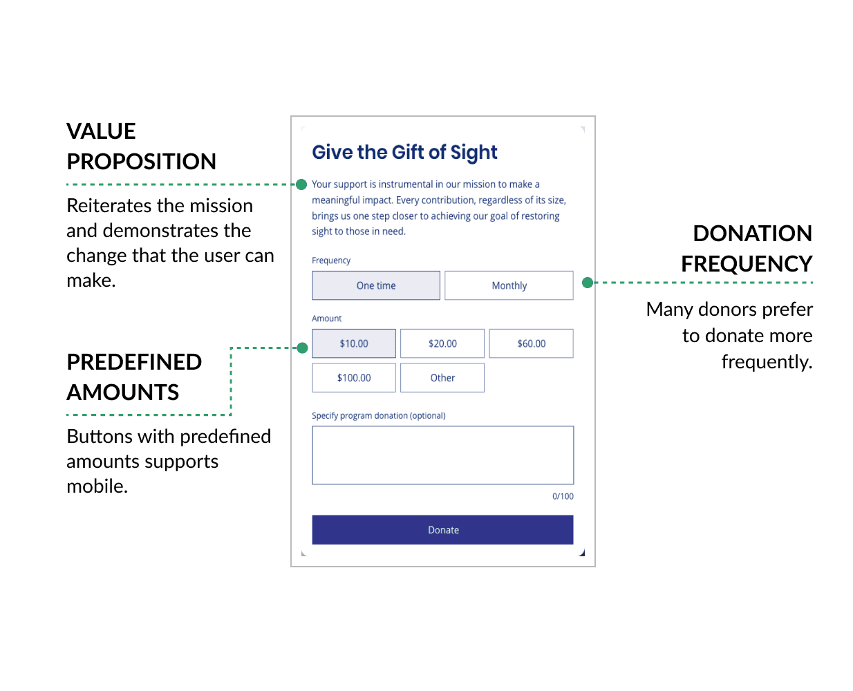
While conducting the site audit, we found several critical issues that needed to be addressed right away. One of these issues was that the donation modal only allowed users to donate $1. This created friction, and it was no surprise that the client reported receiving no donations through the site. We decided to redesign the entire modal to improve the interaction.
BEFORE
AFTER
Before and after donation modal
RESULTS
Once the improvements were implemented, we conducted usability testing with users to validate our changes.
Positive Outcomes:
Fewer Clicks: On average, it took users 1 click less (going from 4 to 3) to move through the treatment flow.
200% increase in Donations: The redesigned donation process had an immediate impact, learning to an increase in contributions via the site.
CONCLUSION
Through teamwork and collaboration, we transformed Retina Global's Knowledge Hub into a more accessible and empowering resource for user seeking retina related information. Despite constraints in time, budget, and platform limitations, we found innovative ways to enhance usability, and accessibility. By restructuring content, improving UI, providing various search options, and adding accessible features, we made information easier to find and understand.
For me, this project was a great learning experience. Not only did it deepen my understanding of accessibility principles, but it also taught me how to implement these strategies within a real-world context. As I move on to new projects, the skills and knowledge I gained during this project will certainly guide me in the future.
LIVE SITE


