CONCEPT
Enabling On-The-Go Learning
How research and UX design principles shaped the design of responsive site that helps users learn wherever they are.
PROJECT OVERVIEW
CONTEXT
A Spice of Life Catering was in dire need of a training solution that could effectively meet the demands of their seasonal business cycles. As a company operating in the events industry, they faced the challenge of rapidly onboarding and training a workforce during their busy season. This struggle negatively impacted employee retention and manager morale and the company struggled to maintain service excellence during peak seasons. In response to this problem, I developed SKILLit, a training solution to meet the needs of a "deskless" workforce.
Although conceived as a conceptual project, SKILLit was grounded in real-world insights gained through interviews with A Spice of Life employees. This case study highlights SKILLit's inception and its potential to address the training challenges faced by A Spice of Life Catering.
MY ROLE
UX Design, UX Research
TIMELINE
8 Months
TOOLS
Figma
Notion

G Suite
SKILLS
UX RESEARCH
UI
ACCESSIBLE DESIGN
INTERACTION DESIGN
VISUAL HIERARCHY
INFORMATION ARCHITECTURE
Solution
User Personas
By delving deep into the needs, preferences, and pain points of the users, I was able to develop a nuanced understanding of the problems that needed to be addressed.
Challenge: Limited Resources
The company had limited resources, particularly when it came to training new hires. With managers juggling multiple responsibilities—from overseeing events to managing operations and handling HR duties—time and resources were stretched thin. In interviews, managers stated that they often pushed training down on their task list in order to complete more important tasks.
Solution: Independent Remote Learning
SKILLit helps to free up manager time by empowering new hires to engage in independent, self-paced learning. By empowering employees to take charge of their training journey, SKILLit not only reduces the strain on managerial resources but also fosters a more efficient and effective learning experience. Features include, task management and a guided tour.
Challenge: "Deskless" Workforce
Observations brought to light a significant challenge arising from the nature of catering work: managing a deskless workforce. Catering staff, predominantly operating at various event venues, lack access to computers and centralized workstations and desktop-based systems are ineffective in this scenario. Moreover, the transient nature of catering work complicates the ability of managers to provide consistent training. This emphasized the need for a mobile-friendly training solution tailored to the unique needs of a "deskless" workforce.
Solution: Responsive Design
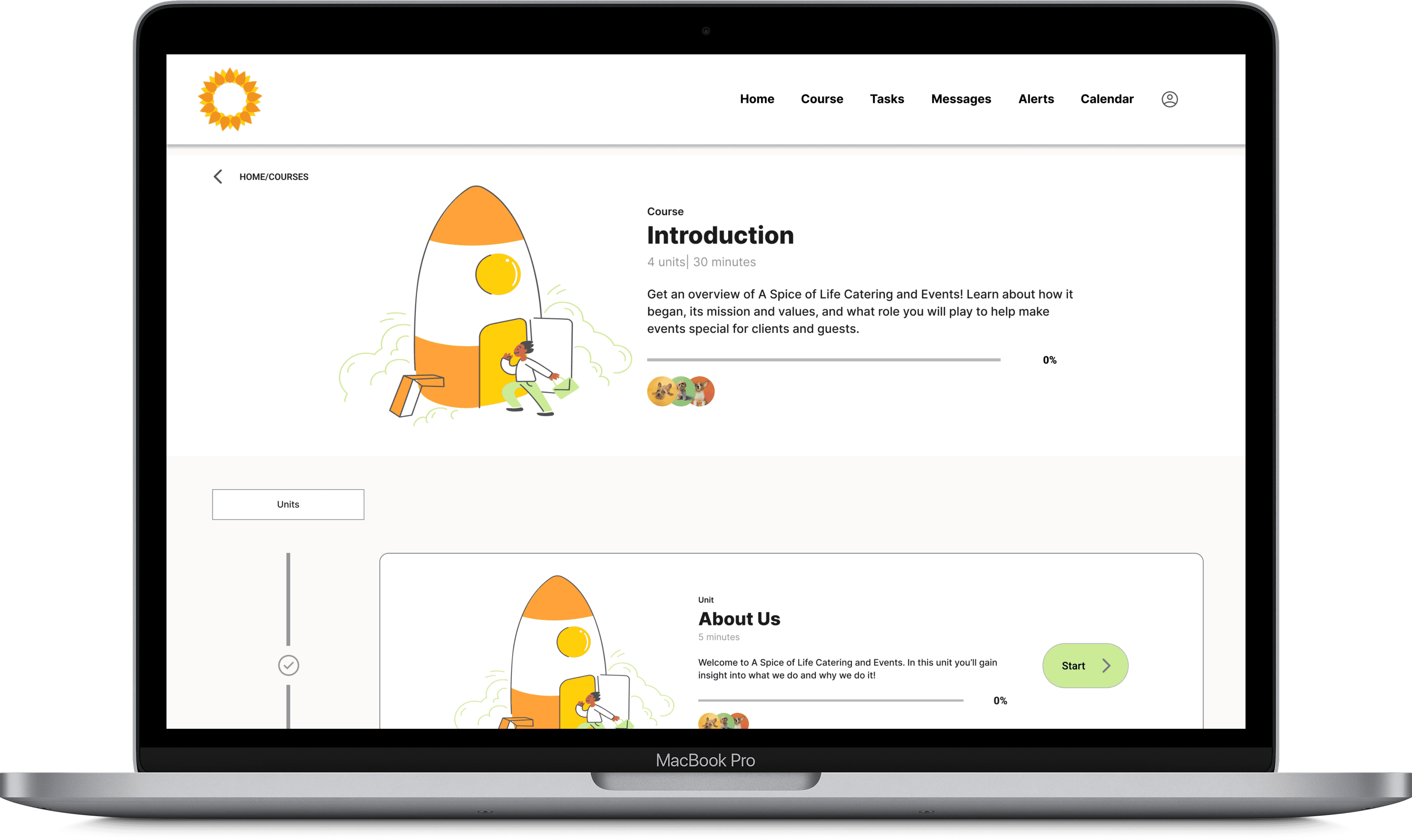
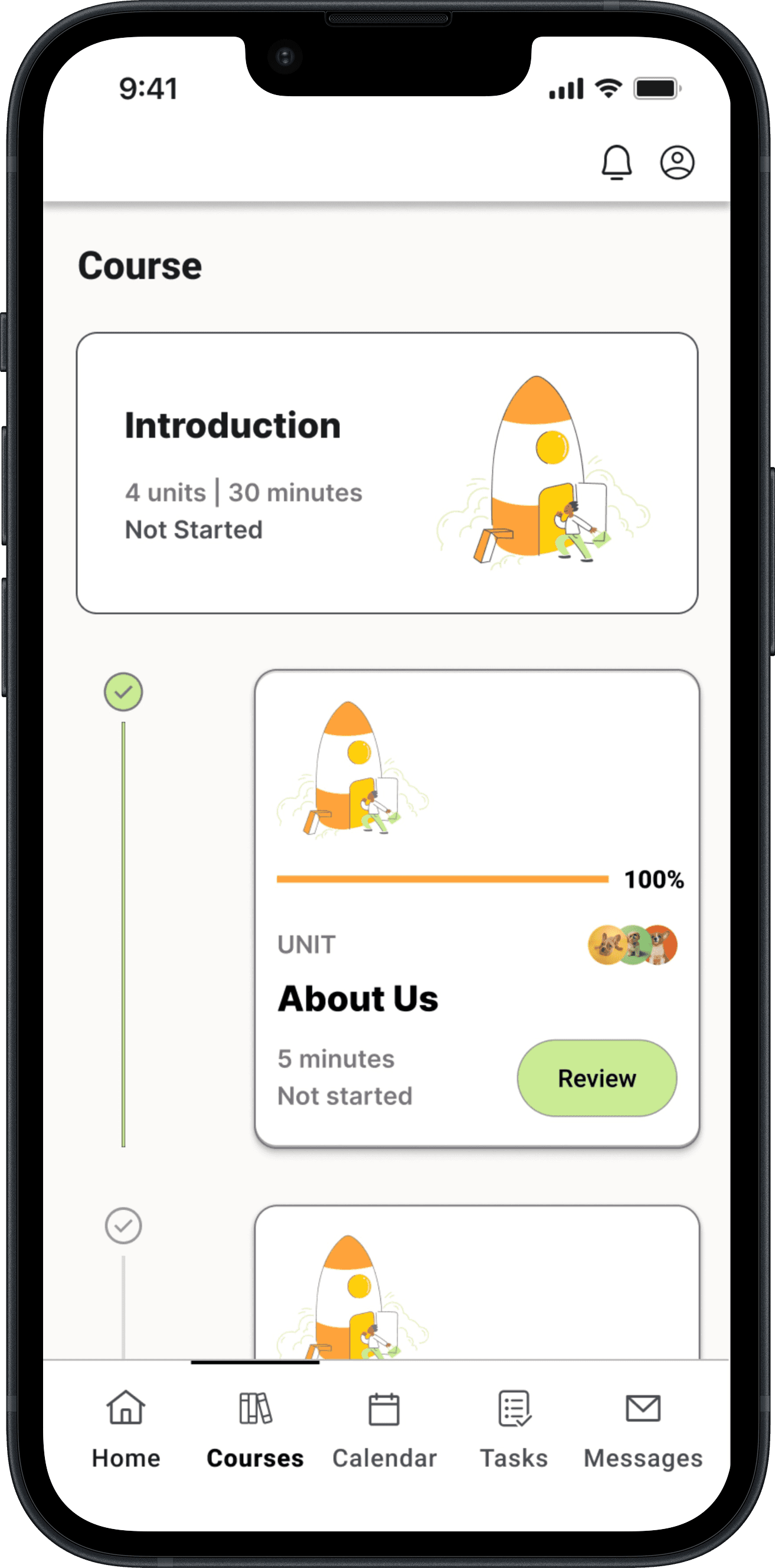
SKILLit addresses potential physical barriers by providing a responsive training platform accessible on both desktop and mobile devices, ensuring that employees can access training materials despite their location.
Challenge: Training Integration
While remote training addressed one issue, integrating training while employees are engaged in event duties created additional challenges:
Balancing training with event operations.
Giving priority to service during events over training,
The varying downtime at events further complicates a standardized training schedule.
Employees may experience mental fatigue or reduced receptiveness to training after physically demanding work.
Solution: Bite Sized Interactive Learning
Modular Trainings
SKILLit offers modular training materials for flexibility and allows users to quickly pick up where they left off.
Engaging Elements
In addition it aims to to increase engagement through the use of quizzes, videos and progress indicators.

Usability Testing
Ensuring that the training solution effectively addressed the identified challenges while remaining user-friendly was paramount. To evaluate this, I conducted extensive usability tests for both the mobile and desktop applications of SKILLit. While the overall results were positive, indicating successful alignment with user needs, there were areas that. could be improved.
Implementing Fixes
Onboarding Flow
Users took too long to navigate through the onboarding tour. In response, I implemented changes focused on facilitating quicker and more effortless navigation for users.
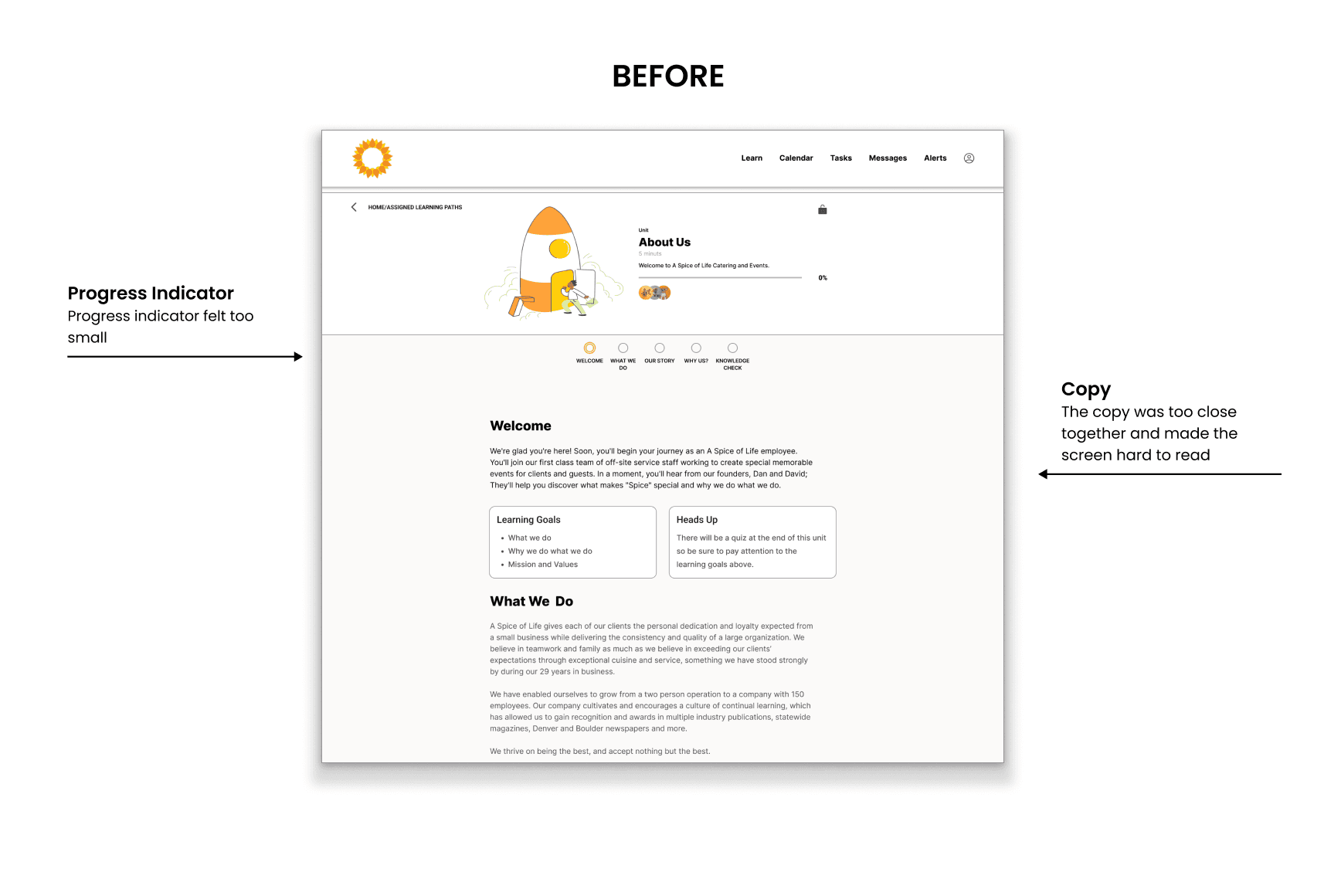
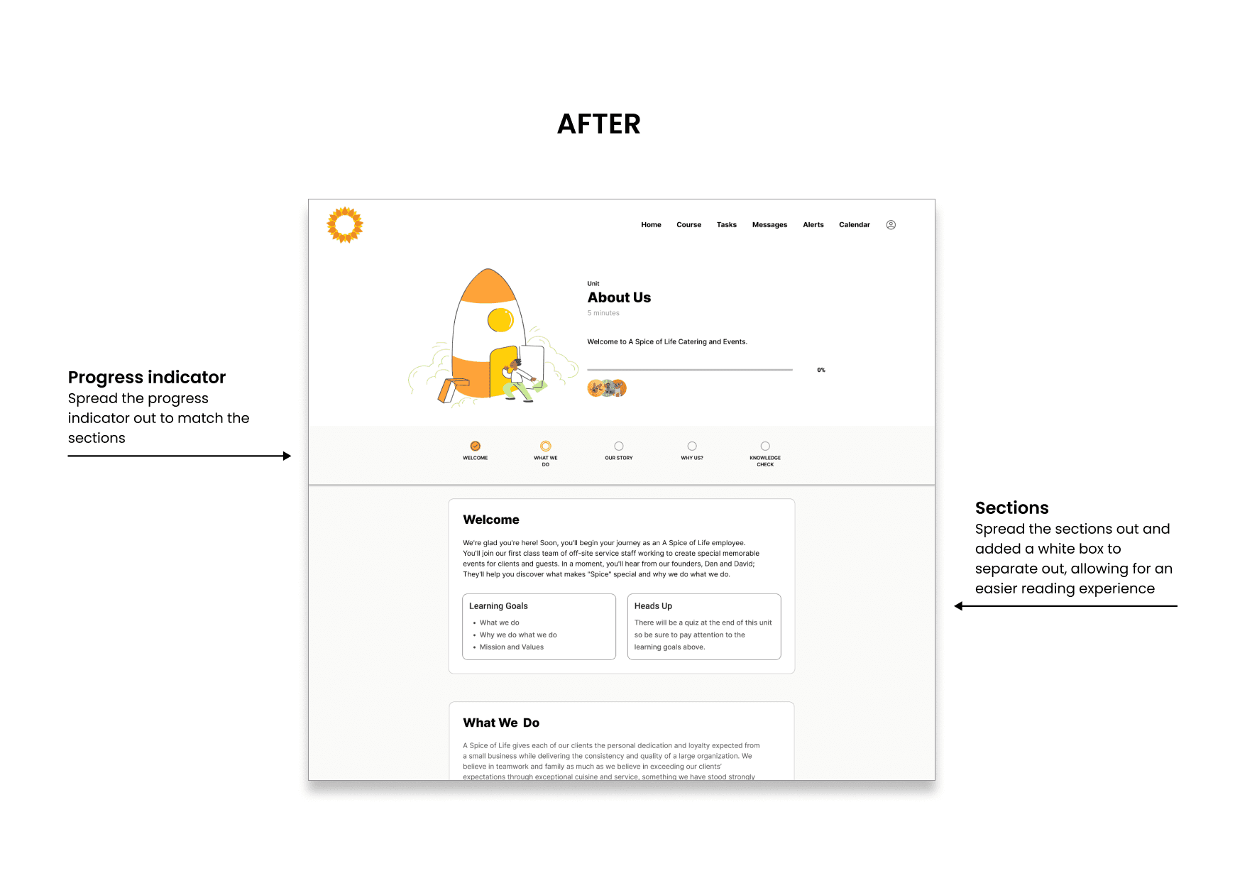
Desktop Course Page
The lack of space between sections overwhelmed users. Incorporating more white space around each section provides more emphasis to each section and makes the page feel less overwhelming.
Learnings
Sticking to a brand's guidelines in UX design is essential because it:
Maintains brand consistency for user recognition and trust.
Ensures clarity and coherence in the design.
Communicates the brand's message effectively.
Streamlines the design process for efficiency.
Conclusion
In conclusion, while this was a conceptual project, the journey from identifying challenges to implementing solutions and conducting usability tests for SKILLit has been enlightening. Throughout the process, I applied various UX processes to develop SKILLit. However, perhaps the area where I learned the most was in user research. Learning how to craft a comprehensive user research plan, engage with interviewees, and translate research insights into actionable features has been invaluable. This project has not only provided practical experience but has also deepened my understanding of the critical role that user research plays in informing product development and enhancing user experiences.


